I've been traveling around the Southwest this week, but just thought I'd share a few pictures from this super cool restaurant - AZ88. It had me sold at the Panton chairs.
The shape of the martini glass was also a sight to behold. And hold.
Love the wall art.
Unfortunately, nothing can make wing sauce look chic.
Thursday, September 29, 2011
Friday, September 23, 2011
The Switch Up
I'm guessing you won't find this nearly as fascinating as I do, but I'm going to share it anyway... I decided to switch up my Ferm Living small cup from my by the sink cup to my makeup brush cup. Works equally well, no?
I replaced it with a rat. Quite the yin yang of bathroom dishware if you ask me :) Happy Weekend!
Wednesday, September 21, 2011
International Reading
My favorite September glossies had a common theme, I noticed...
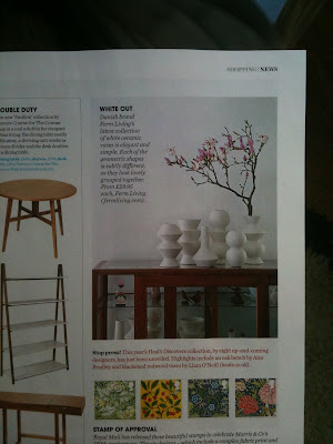
Here are our Ferm Living vases in Elle Decor UK!
What about Aussies? (Side note: Do you like my new magazine holder?)
Yep, I spy our ceramic vase in Living Etc too! Gorgeous room, no?
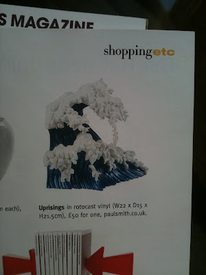
In other Living Etc news... I love that wave book end.
This page needed to be dog eared... for the amazing example of REALLY BIG art. Dig it.
Also, this guy seems very cool. Makes me rethink purple for men. Can't wait to see what pops up in October mags!
Friday, September 16, 2011
Coffee Table Update
My coffee table arrived just as scheduled yesterday. So I had to spend part of the afternoon sitting on my sofa and admiring it. One of the things, on a growing list, I like about it is that I can see my ferm living basket through it! Always best to leave views of Ferm Living unobstructed... Happy Weekend!
Thursday, September 15, 2011
DECORupdATE
So this is post is going to be an update on Holly's Decorate Book tour... Get it? In a nutshell, the book is a must purchase situation, and Holly's as fabulous as you'd expect! It was such a treat to finally meet her in person. Here she is at the Anthropologie book tour in SF chatting about mood boards. Sitting there I wondered why have I never made a mood board? Laziness? Most likely. I'm almost motivated to give it a whirl though. Seems like a good way to avoid serious decor missteps...
Halfway through Holly's mood board demo something clever caught my eye. Can you see it?
Give up? It's our Studio 3. What a coincidence! Except, well, not really... I mean who wouldn't want one of those on their mood board after all. This one was featured in a German decor mag from what I can tell.
Here's the guest of honor signing books.
After I got my book signed, I realized that the only people I knew there were still in line. I started to feel beyond awkward just standing there waiting so decided to take a spin around the store which is when I bumped into my future boots. The short, clog ones. Aren't they superb? Oh, that's right, you can't tell because I have not mastered taking iPhone photos.
I didn't get the boots then. But... I just got this adorable "birthday card" from Anthropologie (very thoughtful of them, no?) which has me thinking that what's in the stars for me are those boots.
Something else that is in the stars for me, is this coffee table. It is being delivered today! Interestingly enough, the story behind this purchase was one of fate. In that, I found it on One King's Lane killing time while my coffee was brewing and managed to snag it before some other less lucky shopper! Honestly though, I'd been looking for a large glass/acrylic (reasonably priced) coffee table for weeks to no avail and then this perfect piece popped up! Yeah, definitely written in the stars...
Wednesday, September 14, 2011
Wallpaper by the Yard
If you looking for small amounts of wallpaper, we just added this Wallpaper by the Yard section over at Hygge & West which includes designs from Ferm Living, Hygge & West, and More!
Tuesday, September 13, 2011
Design Sponge Book
I'm sure you've all heard the Design Sponge book is out! And you probably already have a copy...
Just in case you don't, here's reason #367 to get it. Check out that fab wallpaper! What do you know? It's our Ribbed Wallpaper in beige in the home of the lovely Meg Mateo Ilasco.
We were also delighted to be included among a handful of fantastic companies on the wallpaper resource page. Thanks, Grace!
Monday, September 5, 2011
Labor Day Reading
Just wanted to share with you my new very favorite book, Moderne: Fashioning the French Interior, by Sarah Schleuning. If you love pattern, interior design, the roaring twenties, and/or France, I promise you won't be sad if you buy Moderne. It contains a collection of over 200 plates drawn by famous interior designers in France during the 1920's. Before color photography, their renderings still capture luxurious textures, deep jewel tones and mixes of pattern that seem so fresh and new to me. I can't get over some of them. They are just too good!
I first saw Moderne at Paul Smith in Paris in 2009. A few weeks ago, I was hunting down this picture that I took there, because it is going to be the inspiration for my very first commissioned painting I'm getting for my new apartment. Doesn't that sound so adult of me? It isn't actually, because a more responsible adult would actually save their money :) But, I get a kick out of saying "commissioned" because I'm not the type of person that would ever use that word with any seriousness and yet, I guess, that is sort of what I am doing. A very talented artist friend of mine actually generously agreed to help me add some color to my place in the form of huge roses. Inspired by Moderne, I think I shall call this having a painting "fashioned." Now that sounds tres chic. Anyway, I've been dreaming about this accent wall ever since I saw it and figured if I've loved it for two years, I'll surely love it for a lifetime. That's the hope. Because it is going to be, well, very noticeable in both size (huge) and color (bright pink)...
Back to the book. So, as I was hunting for that roses photo, I stumbled across this quick snapshot I'd taken of Moderne and was reminded that myself two years ago really wanted to buy it. I couldn't remember why, but myself two years later thought I'd probably had a good idea back then, so shouldn't wait any longer...
Moderne arrived last week, and this morning was just the right time to laze in bed and crack it open. WOOOAH. This image made me giddy. The colors, the shapes - it is a pattern perfection. And, this was only the first plate. From there till the last page it just didn't stop.
Hello gorgeous red screen! What is that beautiful rug/blanket hanging over the balcony, and why don't I live in a two story apartment (palace) with a balcony so I can do that too? Also, this feels a little pre-color blocking, color blocking, no? I dig it all. I'm really wishing I could go Midnight in Paris on this place and have a visit with whoever used to live here. No doubt they'd serve delightful cocktails as we discussed important things like cinema and jazz.
Don't these wallpaper designs feel completely current? Or maybe it is just that contemporary design has been revisiting the past more and more lately? Or maybe they are in reproduction and that is why they seem so familiar? Birds and gold fish are two things that I will always love to see in decor no matter how trendy they may or may not be. Seeing them from the 1920s like this reinforces just how timeless they really are.
Ummmmm, this room is to die for. Please note big rosy rug. More proof that large pink roses are classic, right? Or at least that is how I am interpreting this picture due to the impending painting situation. The floral pouf here is, for lack of a better word, amazing. What I love about seeing rooms like this that are drawn rather than photographed is that so much is still left to the imagination and open for individual interpretation and inspiration. For example, what is that pouf made out of - wool, tapestry, linen? Is the wall covered in paper or fabric? Is the green chair velvet or leather? Who's to say? They can be whatever we want them to be!
I don't know who's invited me or what is being served, but, yes please, I will be at this dinner party in a heartbeat. Does anything beat mixing graphic black and white with bright color and bold pattern? Didn't think so.
That light fixture is insane. Look, even the children seem to have fainted from its greatness. They could also be in awe, like me, of the rug/wallpaper combo. That is how you fashion a room up right!
I would almost never opt for browns over grays, and I don't love purple all that much. But, I would happily eat, work and sleep in this cozy nook until I was forcibly removed.
Finally, I don't even have the words for how fantastic this space is. I know I'm biased, but isn't it ALL about the wallpaper sometimes? :) You just can't go wrong with it. Happy reading!
I first saw Moderne at Paul Smith in Paris in 2009. A few weeks ago, I was hunting down this picture that I took there, because it is going to be the inspiration for my very first commissioned painting I'm getting for my new apartment. Doesn't that sound so adult of me? It isn't actually, because a more responsible adult would actually save their money :) But, I get a kick out of saying "commissioned" because I'm not the type of person that would ever use that word with any seriousness and yet, I guess, that is sort of what I am doing. A very talented artist friend of mine actually generously agreed to help me add some color to my place in the form of huge roses. Inspired by Moderne, I think I shall call this having a painting "fashioned." Now that sounds tres chic. Anyway, I've been dreaming about this accent wall ever since I saw it and figured if I've loved it for two years, I'll surely love it for a lifetime. That's the hope. Because it is going to be, well, very noticeable in both size (huge) and color (bright pink)...
Back to the book. So, as I was hunting for that roses photo, I stumbled across this quick snapshot I'd taken of Moderne and was reminded that myself two years ago really wanted to buy it. I couldn't remember why, but myself two years later thought I'd probably had a good idea back then, so shouldn't wait any longer...
Moderne arrived last week, and this morning was just the right time to laze in bed and crack it open. WOOOAH. This image made me giddy. The colors, the shapes - it is a pattern perfection. And, this was only the first plate. From there till the last page it just didn't stop.
Hello gorgeous red screen! What is that beautiful rug/blanket hanging over the balcony, and why don't I live in a two story apartment (palace) with a balcony so I can do that too? Also, this feels a little pre-color blocking, color blocking, no? I dig it all. I'm really wishing I could go Midnight in Paris on this place and have a visit with whoever used to live here. No doubt they'd serve delightful cocktails as we discussed important things like cinema and jazz.
Don't these wallpaper designs feel completely current? Or maybe it is just that contemporary design has been revisiting the past more and more lately? Or maybe they are in reproduction and that is why they seem so familiar? Birds and gold fish are two things that I will always love to see in decor no matter how trendy they may or may not be. Seeing them from the 1920s like this reinforces just how timeless they really are.
Ummmmm, this room is to die for. Please note big rosy rug. More proof that large pink roses are classic, right? Or at least that is how I am interpreting this picture due to the impending painting situation. The floral pouf here is, for lack of a better word, amazing. What I love about seeing rooms like this that are drawn rather than photographed is that so much is still left to the imagination and open for individual interpretation and inspiration. For example, what is that pouf made out of - wool, tapestry, linen? Is the wall covered in paper or fabric? Is the green chair velvet or leather? Who's to say? They can be whatever we want them to be!
I don't know who's invited me or what is being served, but, yes please, I will be at this dinner party in a heartbeat. Does anything beat mixing graphic black and white with bright color and bold pattern? Didn't think so.
That light fixture is insane. Look, even the children seem to have fainted from its greatness. They could also be in awe, like me, of the rug/wallpaper combo. That is how you fashion a room up right!
I would almost never opt for browns over grays, and I don't love purple all that much. But, I would happily eat, work and sleep in this cozy nook until I was forcibly removed.
Finally, I don't even have the words for how fantastic this space is. I know I'm biased, but isn't it ALL about the wallpaper sometimes? :) You just can't go wrong with it. Happy reading!
Thursday, September 1, 2011
A Sprinkling of Ferm
Not to neglect the bathroom from partaking in Ferm Living fun, I put this little cup by the sink. I think it is adorable, and the dusty green color works perfectly with these...
red Roman Shades that I recently made. Oh, and if you do happen to stop by for cocktails or something, please don't try to open or close them. They have about a 95% fail rate. DIYing things sure can be challenging sometimes for those without the ability to pay close attention to detail.
Subscribe to:
Posts (Atom)