Is Hawaii?? Mike and Vivi-Ann just put up a Map of the World Wall Sticker in the living room of their San Francisco apartment. And, it looks so cool! The map is one of my very favorites. Vivi-Ann happens to be a dear childhood friend of Trine (ferm LIVING's fabulous designer and creative director in Denmark) and my newest friend!
Vivi-Ann and Mike got married last year in Hawaii where Mike grew up. Here, Mike is pointing to the spot where Hawaii should be. Hmmmm, you make an interesting point, Mike. Please don't take it personally!
Vivi-Ann also volunteered to teach us more about Hygge, a Danish concept that Aimee and I have both been quite struck by. It is all about being cozy, investing in quality not quantity, taking pride in what you have now, and appreciating the smallest moments and the time spent with family and friends. Basically it is exactly how I want to live (from my limited understanding of it, anyway). That's Vivi-Ann above teaching me lesson one in living hygge - play hooky once in awhile and don't be afraid to express your inner child!
Actually, I think my friend Kate's baby, Olivia, ended up with the lead role of hygge mentor! It was her first birthday today, and she loved showing us all how to put your hands up high! Happy Birthday, Olivia! And, thank you so much for sharing your pictures with us Vivi!
Wednesday, April 30, 2008
Tuesday, April 29, 2008
Scrap Art
Monday, April 28, 2008
Welcome to the Yukon!
FedEx wouldn't do it. UPS seemed too afraid. But neither snow nor rain nor heat nor gloom of night would deter USPS from delivering a power pole wall sticker up to Jen and Paul in Whitehorse, Yukon!
And, we're all so happy they did! The Power Pole looks fantastic - almost as majestic looking as their lovely dog. Their space is so warm with all the natural woods and healthy plants, so the more industrial power pole is such a great way to mix things up!
Here's their cat also enjoying the power pole (I'm guessing...) and the bright sunlight streaming in through the windows.
I hate to admit this, but I didn't really picture sunny days in the Yukon (or people really living there), but I've done some investigating and it looks like the weather is spectacular (for a month or so of summer...), and over 30,000 people reside there. But, of those 30,000, only 2 have a wall decal that is this cool!!!
Thank you so much for sharing your home with us Jen and Paul!
Sunday, April 27, 2008
A Clever Frame of Mind
Carl, in New Jersey, just send us these fabulous pictures of the Feather wallpaper he recently framed. We've always thought ferm LIVING wallpaper is a work of art, so it's reassuring to see that Carl agrees!
He chose a charcoal gray mat to complement the green paper and the gold frame. Excellent combo!
If you notice, he also got crafty with his Ikea Lack bookshelf. I actually have the same one - perfectly simple and clean-lined (and perfectly aligned with my budget). He turned it on its side and installed particle board shelves covered with contact paper. Looks great! And, I love his mix of black and white with the vibrant greens and blues. Thank you for sharing your pictures with us, Carl!
Friday, April 25, 2008
Happiness Is...
picking out the perfect paper for a wall in need;
being just a little bit bad because you're feeling so good;
wasting time on your favorite obsessions;
discovering the ultimate shoe for all seasons;
reading a bold statement;
writing an optimistic statement;
making a colorful statement;
drawing despite a complete lack of skill;
saying thank you unexpectedly;
appreciating the smallest moments; and
having an entire weekend right in front of you. Have a great weekend!
Ferm Soup
They say that we're all only separated by 7 degrees - so the way we figure it, Christiana and I are now THIS CLOSE to Joel McHale of our favorite E show, The Soup. How, you ask? Well...Tyra and Rock of Love II are constantly earning airtime on the Soup, and in just the past few weeks, ferm LIVING has been featured on both!
Watch this clip from Tyra as the lovely Kelly Edwards demonstrates how to create a killer coffee table using our Feather wallpaper. Don't worry, Tyra keeps it under control - no screaming "PANTY PARTY!!" or telling people to kiss her fat you know what in this clip.
And earlier, Kingflower could be seen on Rock of Love II. In a shocking season finale, Brett chose smart, classy(ish) Ambre over sexy but not so bright Daisy. I just wish they'd brought Kristi Joe back.
All this media exposure has Christiana and I feeling a bit like reality stars! Now we just need to figure out how to get ferm LIVING on The Hills - LC, you need some wallpaper, girlfriend?
Wednesday, April 23, 2008
Shameless Plug
You'll notice that Christiana and I tend to stick pretty closely to all things ferm in our blog, but every now and then, we feel unrelated things bear mentioning. This is one of them. I planned a conference here in Minneapolis last year and had the opportunity to meet Eric Ryan, CEO and founder of method - one of my very favorite brands. Eric, for the record, was a great guy - I had to keep reminding myself that he was CEO of method, cause he seemed like that guy from college who was always playing the guitar on the green and wore shorts and flip flops even when it was 20 degrees out. Anyway, Eric told me about their advocates program, which I immediately joined, because a) I love me some method, and b) you get free stuff if you are chosen.
Just last week, I received their new book, Squeaky Green (available on Amazon). It's published by Chronicle Books and is very nicely designed and well written, though it does seem a bit like a really long ad masquerading as a book sometimes. That said, it does offer a lot of good tips for easy ways to keep clean without all the chemicals - and it has a great list of resources as well.
Today, this little gem arrived announcing their new line for babies and kids. As a mother of 2 who is constantly looking for affordable ways to bring more natural/organic type products into our home, I am all over this and will be purchasing it as soon as it comes out. I am always amazed by method's ability to elevate simple packaging to a piece of art. The baby soap lid doubles as a cup to rinse baby off with, and will certainly be a well used bath toy as well - so ingenious. The product smells delicious - the kid product has a seal on the bottom with scratch 'n sniff, which I usually am opposed to - anyone remember the popcorn scented scratch 'n sniff stickers? Yikes.
The wonderful bottles are currently bringing a new level of "design" to my 1941 peach tiled bathroom. Apparently that was all the rage in the '40s, cause I've seem many variations on this color scheme in friends' bathrooms.
Oh, and one last thing - the product literature encourages you to "clean like a mother." The copywriter deserves a raise for that one. Thanks, method!
Hot off the Press
I just received a copy of Canadian House and Home's special summer edition for condos, lofts and apartments (aka renters). It was such a treat to see ferm LIVING's branches featured as a must have item for those who want to add a little nature to their indoor spaces. And, they make an excellent point - wall stickers really are a fantastic option for renters.
Is it me or does the word pleasure in the title of a magazine not necessarily conjure up images of wall decor? Maybe it should. After all, here are two lovely ferm LIVING wall stickers looking ever so pretty between the covers of Pleasure Scene, Nashville's lifestyle magazine. In any case, P.S. just came in the mail today, and it was a true pleasure to see our wall stickers featured in it!
Go Music City, USA!
Tuesday, April 22, 2008
Free Bird!
Freefroot.com is a new website that gives away, well, things for free. It is a little tricky because you have to follow the products you want until they become available for the giveaway. I missed a couple really cool books I would have loved to have, but did end up the proud winner of some gourmet candies, so at least I know it works. Today's contest is for carbon free bulbs. Quite fitting for such an important day. Happy Earth Day!!!
I was a touch skeptical about the website's name, but I love the concept. I've never exactly been one to shy away from free stuff. So, we decided to help out the cause and give away a Sparrow wall sticker in a couple of weeks. Mark your calendars. This is one free bird you shouldn't let get away!
Saturday, April 19, 2008
Tyra!!!
I spent Friday afternoon playing hooky and watching a full episode of Tyra. Normally, I'm quite happy to get my dose of Tyra on VH1's Best Week Ever, but seeing as how yesterday was, from a clever spaces perspective, Tyra's best show ever, it deserved our full attention!
Tyra was styling people's lives and invited our favorite designer on a budget, the fabulous Kelly Edwards of Design on a Dime, to help out a viewer, Lisa, with revamping her apartment. That's Kelly above. Sorry about the bad picture quality. I'm technologically challenged...
The key ingredient for Lisa's space makeover? A ferm LIVING Feather wallpapered table. Kelly took the audience through her simple process of how to turn a boring coffee table into an eye catching masterpiece. Here's her step by step. ONE) Start with the perfect wallpaper and some spray adhesive (above).
TWO) Spray the adhesive and start unrolling the paper out onto the flat surface. Easy, right?
THREE) Ask Tyra for a helping hand. Please note that this step is not necessary.
FOUR) Cut the paper and smooth it out a little more. (I think that's what they are doing?)
FIVE) Work the paper over the edges.
SIX - VOILA!) Okay, not totally sure about the final steps because they took a commercial break and suddenly a stunning table was complete! We ADORE it!!!! So did Lisa apparently, as Tyra's website notes: "Lisa loved the coffee table so much, immediately after the show her mom pulled up in the family car and the staff loaded the table into the vehicle. It’s now on display in her home in the Bronx. BONUS SECRET: The entire staff and crew munched on BBQ ribs and NO BAKE cake after the show." We're digging the sound of the after-party too... We're hoping we can get some better pictures of the project and hopefully a more detailed step by step, but we were too impatient to wait for those before we shared our Tyra debut!
THANK YOU so very much Kelly for using ferm LIVING for this project! We think you picked the perfect paper for the job!
Wednesday, April 16, 2008
Floating Hydrangea; Revisited
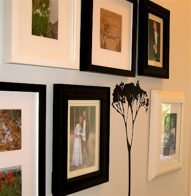
Never shy to jump on a new trend (unless it's a bad trend, of course, e.g. latex leggings), I found the perfect spot for my floating hydrangea stem. That it happens to cover some nail holes that I've been too lazy to paint over is an extra bonus. I actually had to cut the stem to change its angle for maximum nail hole coverage, but you can't tell at all!
I think it's a nice way to connect the natural element of my beautiful new painting of a California buckeye pod by Lisa Congdon in my kitchen into the hallway. I was so excited to pick up Lisa's artwork at Rare Device today!
While I was at Rare Device, I also couldn't resist getting this delightful little painting by Kate Durkin too! Next up... Wilderness in black lacquer in my bedroom. This is going to be goooood!
Subscribe to:
Posts (Atom)